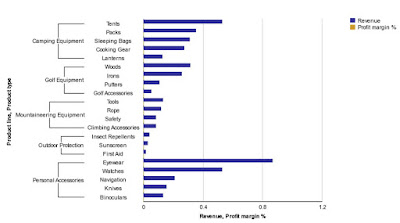
This example shows, how to add secondary value axis to the chart in C10 Report Studio. For example in this bar chart 'revenue' and 'profit margin %' measures can't use same axis (Pic.1.)
 |
| Pic.1 |
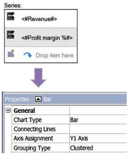
1. Click the second value series in the chart area and go to it's properties (Pic. 2).
 |
| Pic. 2 |
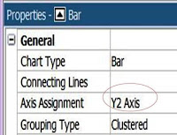
2. Then just change Axis Assignment to Y2 Axis (Pic3).
 |
| Pic. 3 |
In this example I had the horizontal chart which means that the axis above is secondary axis - Y2. Because I show series labels in the chart, I changed axis in order to series order, 'Revenue' --> Y2 and 'Profit Margin %' --> Y1. Then I changed 'Profit Margin %' chart type to Line and set data point marker shape to star and set "show line" --> No.


I've looking for this information all over the internet and finally found you!!! Thank you for the explicit images to follow.
ReplyDeleteYou're welcome! I'm glad you found me :)
Deletehttp://www.cognosasksumeet.blogspot.in/search/label/Cognos%3A%20Creating%20Gantt%20Chart%20using%20Crosstab
ReplyDelete